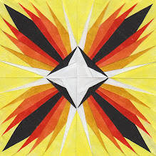
Below you will find Version 1 and Version 2. I am leaning towards Version 2. Version 1 might be a drop too busy for this round. This round should be a little quieter than the previous ones. Also, I don't know if you can notice, but I tried to design round four with a way to make it easy to work into round five. Hopefully, it will fit with the rules for round five. If not, I will make my own rules!
Please let me know, in the comments section, what you think about version 1 and version 2, and why. I will not have time to do any cutting or sewing until Sunday, anyway.
Version 1
Version 2
Two of my favorite bloggers are giving away great stuff. First there's Karen of Sew Many Ways who's giving away a bunch of her Tool Time Tuesday supplies to celebrate one year of TTT. You have until March 21 to enter. You really should go through her blog to read some of her ideas. She's also added two beautiful Moda Fat Quarters and a couple of patterns.
Then there's one of my favorite podcasters, Jackie of Jackie's Quilting Chronicles and Canton Village Quiltworks who recently interviewed Karen Griska of The Selvage Blog, another one of my favorite bloggers from a while back. Jackie is helping Karen to give away TWO autographed copies of her wonderful book, Quilts from the Selvage Edge. You have until March 22 to enter.
I'm slowly working on a selvage quilt, but am really low on selvages. (Hint, hint!)
Enjoy your weekend,
Debbie


 Quilter Blogs & Store Search
I really like Version 1 best. For some reason, the points on Version 2 look very POINTY to me, almost sharp. I think there are are enough points in this beautiful design, and the squares seem to calm it down a bit.
ReplyDeleteOn another subject, are you planning on going to Pissott for the get-together?
I also like Version 1 best, it just seems to be in harmony with the previous rounds. Carol
ReplyDeleteI had a hard time deciding. Version 1 seems unfinished, calling for something else to be added - that something else might be Round 5! Version 2 looks totally finished to me, I would be hard pressed to decide on Round 5. So, I guess I will also go with Version 1. Good luck.
ReplyDeleteBobbie in Lockport, IL
I, like two others have commented, prefer Version 1. To me, its soothing and something I could look at and smile. Sounds crazy I know, but Version 2 seems aggressive! Depends on what look you're going for.
ReplyDeleteMarty in WA
HI Debbie, Thank you for stopping by my blog and signing up for the giveaway! Good luck!! Also, thanks for being a podcast listener. I love your blog and have signed up as a follower! I think you are right about Version 2, slightly less busy. I like it!
ReplyDeleteHm - I like version 1 also. The design around the edges just look like they fit better - keep the focus on the center - where ver 2 seems to attract more attention to the border.
ReplyDeleteLike both for different reasons but version 1 looks more conducive to adding more rounds. Version 2 looks more complete on it's own and would be harder to connect to another round.
ReplyDeleteDenise C. So. CA
Hi Debbie, I like #1 best. I am off to see your friends giveaways. Also check out my birthday giveaway.
ReplyDeletehttp://beadwright.blogspot.com
Nicole/Beadwright
Thanks for the input from the anonymous commenters to whom I am unable to reply to privately. Looks like Version 1 won by a landslide! I've started working on it already. Will post a photo when I'm done.
ReplyDeleteHave you completed it? Waiting....
ReplyDeleteHugs,
Deepa